Fishsim 2 - Customisation
The guide below was written by John B Wirral in December 2003 and is reproduced with permission.

The guide was written using PSP7 but other editors will have similar features.
Note: Some of these images are not that sharp, each picture can be clicked to view a clearer version in a separate window.
The guide is also available as a download in HTML format from the SD Downer.
Create Your Own Angler for Fishsim 2
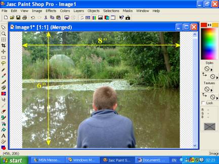
The size of the photo used is not critical, but the
bigger the better for cutting out purposes and it is easier to work with as
the size of your cut-out picture can be changed later on.
Please note: Whenever you use any of the options on the
left side of the above example, after you have finished, remember to choose
another option or the cursor before you continue.
Sec. 1 CUTTING OUT YOUR ANGLER
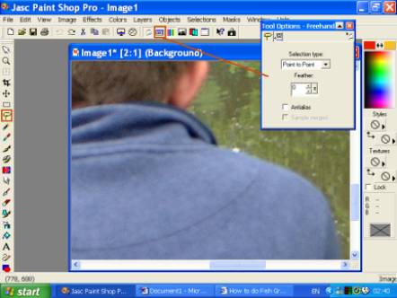
Using the settings as below and using the freehand
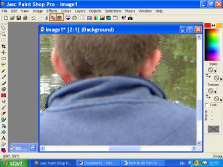
tool, cut out you angler (trying to keep just inside of the picture).
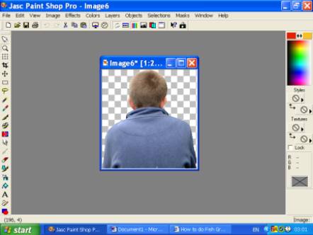
You will be left with the image as below. DO NOT change
the size of your angler at this stage. Now save this pic (Somewhere easy to
find again) as a name of your choice and leave in PSP format.
Sec.2 ADDING A NAME, LOGO ETC
2-1 Adding your name:
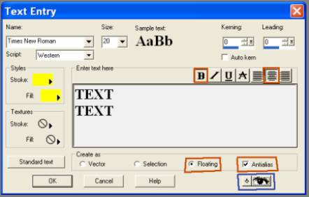
Choose the ‘create or edit text’ option A and click on
your angler, and you will get a box as below.
Each option explained:
Before you start to make any alterations to your text
ensure the text is highlighted first
Name: This is just your choice of font to be used; I
have tried several and found a font called ‘Seagull’ that looks good and
clear (if you don’t have this font, I can always Email it to you if
required).
Size: Size of font to be used. For this you will just
have to alter the size to suit your picture.
Kerning: This can be adjusted for character spacing a
positive number (25) will widen the space between the characters and a
negative number (-25) will bring them closer together.
Leading: This is used for line spacing, and works the
same way as above.
Styles: This is for choosing the colour of your text.
You can experiment with these as to having the stroke and fill different
colours. I have tried different variations, but be aware that something that
my look good on your picture at this stage, may not look so good on the
completed graphic (due to reduction of size and colour depth). Therefore I
tend to stay with the same colour for both options.
Textures: Have never used this for this application.
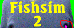
Red Boxes: these four options I always use, the
floating option allows you to move your text into position, and with the
antialias option ticked, allows the text to merge into the picture (the
effect we didn’t want when originally cutting out our angler).
Blue Box: With the eye and the arrow selected you can
see your text on the angler as you do it, so any adjustments needed, can all
be done at that time rather Than having to go in & out all the time.
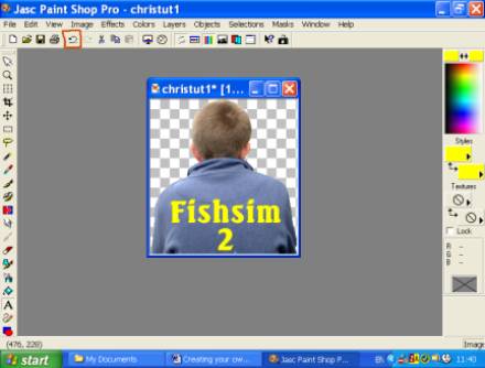
Once you are happy with your text, click ok. Move the
text into the position you want on the angler when done right click to
finish. If once you do this stage and you are not happy with it, don’t worry
just click the undo button (as shown below) once to reposition your text or
several times (to change it) till the text has gone, then just start it
again.
2-2 Adding a logo on the shirt
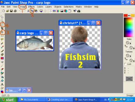
Cut out your logo as explained in Section 1, except for
this application, I tick 'antalias' option, so the logo merges into the
angler's coat.
Click the images (1) button and choose the resize
option to alter the size of your logo to suit, when done click copy (2),
then right click on your angler and choose 'Paste as a new layer'.
To just move your logo, choose the 'mover' (3) or to
move and slightly adjust its size choose 'deformation' (4)
2-3 Adding a hat/cap to your angler:
Cutting out your hat/cap is done in exactly the same as
in section 1. And applying it is done exactly as 1 to 4 above. When
complete, choose the options as below to complete this part.
Note; if you use the ‘deformation’ to slightly alter
the size of your cap, there may be a need to do some touching up, as the cap
may merge slightly and would show up as a white out line in FS2. I will
explain this in the next section.
Sec 3 ADDING THE BACKGROUND
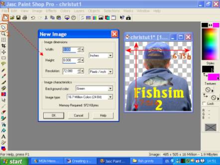
Go into image/ resize and check the size of your
picture. Now create a new image (1) as shown below slightly larger.
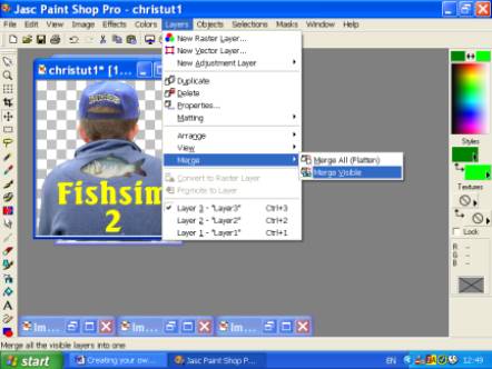
Right click on your angler and choose 'copy' (click
back on the cursor (2)) right click on your background and choose 'paste as
new layer' then go 'layers' and choose option as shown below.
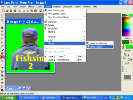
What I do next is to darken the green using the ‘colour
replacer’ (1) and change the ‘styles’ to 2 & 3 as above (on these colours
ensure you don’t use any colour that is already on your angler) with the
options above chosen left double click on your picture.
On the styles option your left mouse button picks the
top colour and your right mouse button the bottom colour. The reason I do
this is in case any of your angler has slightly merged with the background,
if left it will show as an outline on your angler in Fishsim.
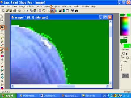
Use the paintbrush (2) to change any light green to
dark green, when happy choose the ‘crop’ (1) tool to cut your angler out
checking the ‘toggle tool option window’ (3) is set to rectangle. Double
click inside the box you have created and this will create a new image,
which we will be using from now on.
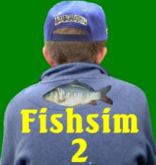
Now choose the ‘colour replacer’ option as before but
this time right double-click to make the dark green back to our light green.
This ensures a crisp edge to our angler when seen in Fishsim.
SEC. 4 REDUCING OUR GRAPHIC TO 256 COLOURS
Now we need to reduce our graphic to 256 colours, to do
this click on ‘colours’ at the top and choose options ‘decrease colour depth
/ 256 colours (8 bit).
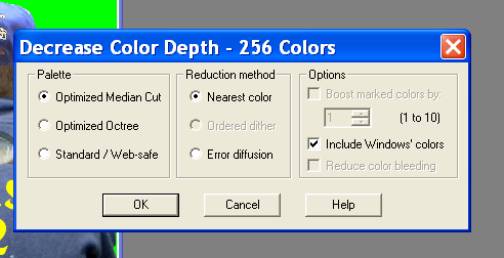
Click yes on the first box, then choose the options as
shown below and click ok.
The colour used for a transparent background, is the
top left colour shown on the left (windows default is always black). To
change this colour to our light green I do it in three stages. Firstly, in
our styles box (as used with the greens) change the colours to black (top)
and pink -255.0.255 (bottom).
Secondly click on ‘colours’ at the top and choose
option ‘edit palette’ and you will get a screen that looks similar (as on
the left), double click on the top left colour (black) and you will get an
option to choose a colour, choose pink and click ok then ok again. With the
style colours set at black and pink, double left click.
The reason I do this, as if there is any black on our
angler, it will automatically change to the colour we choose in the ‘edit
palette’ option. If we chose green straight away, any black would change
also to green, and we would have to it touch up with the paintbrush
Again, click on ‘colours’ at the top and choose option
‘edit palette’, double click on the top left colour (now pink) and you will
get an option to choose a colour, choose the green and click ok then ok
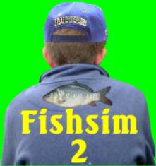
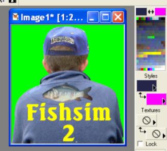
again. That is now this stage finished and your angler and settings on the
right should look like the example below with you back ground colour being
the same as the top left colour on the grid.
SEC 5 RESIZING AND SAVING YOUR ANGLER
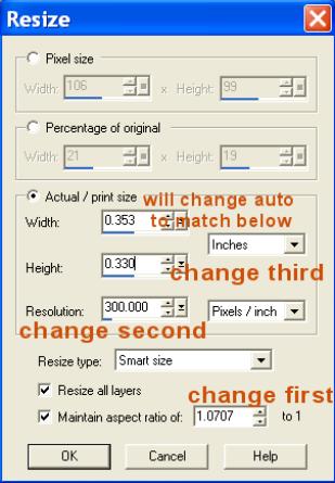
Then click on ‘View’ and choose normal viewing (1-1).
Finally save as man.pcx and put him in your Fishsim2/graphics folder, and
when prompted click yes to replace..
Creating your own Angler for FS2, using PSP7 By
John.B.Wirral Dec 2003.
Reproduced by Simmers Dad with permission.
Web Pages :
- Venues & Addons
- SD Venues
- Challenges
- Customisation
- FS2 Pro
- SD's FS2 Forum
- Running Servers
- Venue Validation
- Facebook Groups
- Other FS2 Sites
